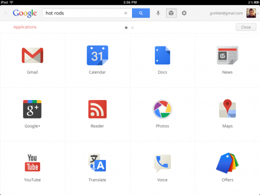
Great news from Google highlighted in an article from Matthew Panzarino over at TheNextWeb. I have had a play with this app and love it. It is super clean and so nice to use. I love that I can incorporate all my pictures, google docs and other google tools so easily on my iPad.
With the announcement of its new Search app, Google gave iPad users more than just a slick and well-made native search app that bests the experience on any Android tablet. It also managed to squeeze the core elements of Chrome OS into Apple’s ecosystem.
Note that I say core elements, because there are aspects of Chrome OS that are obviously not represented here, but it is definitely a huge step in the right direction.
When you launch the new Google Search app, you’ll notice right away that there is a huge difference between it and the much maligned gmail app for iOS. The Gmail app uses a webview for its main component, which in the world of iOS apps is the equivalent of being lazy.
But I have it on good authority that the team that built this app is a completely separate endeavor. What I don’t know, but suspect, is that the team within Google that built this app has ties to the Chrome OS team.
The Search app is built using native controls, which give it a silky smooth operation and that feeling of quickness that doesn’t come easily to an app that is built on a thinly wrapped webview. It also means that you’re greeted with an interface immediately, rather than waiting for a webpage to load.
But the main feature of the app, which is really a simple and gorgeous implementation of Google Search, isn’t the most interesting bit here. To find that, just tap on the Applications button on the main screen.
From here, you have access to the following Google products, all within an iOS wrapper: Gmail, Calendar, Docs, News, Google+, Reader, Photos, Maps, YouTube, Translate, Voice, Offers, Finance, Books and Blogger.
http://thenextweb.com/google-just-used-its-search-app-to-sneak-most-of-chrome-os-onto-the-ipad/

